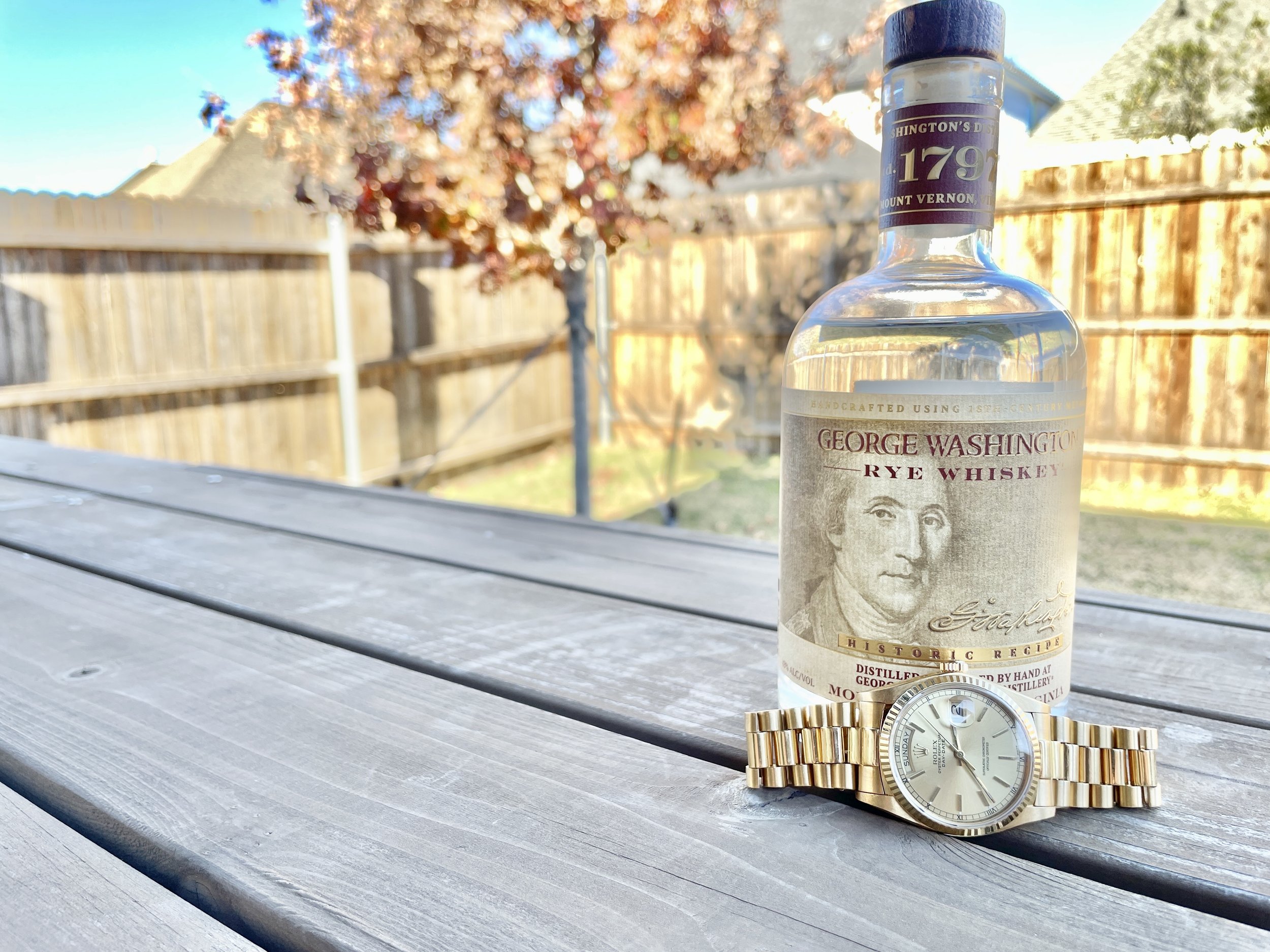
The Most Beautiful Bourbon Bottles out there
About 15 years ago, before I became a bourbon drinker, I was over at a friends house who had a beautiful, squatty bottle on his buffet table with a prancing horse on top. I remember being intrigued and even googling “whiskey with horse on top” when I got home. That led me to the Blanton’s website, where I learned more about the brand, Colonel Blanton, and the significance of their horse stoppers. The thing about that bottle is that it looked so good, that his wife let him keep it on their buffet table as a decoration. That experience was a huge inspiration in the making of this list and we want to celebrate the thoughtfulness and uniqueness of the bottles that our bourbon comes in. We thought about doing a list of our most unfavorite bottles, but we want to spread positivity, not negativity in these crazy times.
One more note is that we didn’t go with rare, impossible to find unicorn bottles (i.e. Old Rip Van Winkle 25) that are rarely seen outside of google image searches on the internet.
My elementary school librarian would always say “you can’t judge a book by it’s cover”, but I never heard her say “you can’t judge a bourbon by it’s bottle”. Not really sure where I was going with that, but here is our list of bourbon bottles you can judge by the bottle. Not only are these bottles great, but these bourbons are fantastic as well.
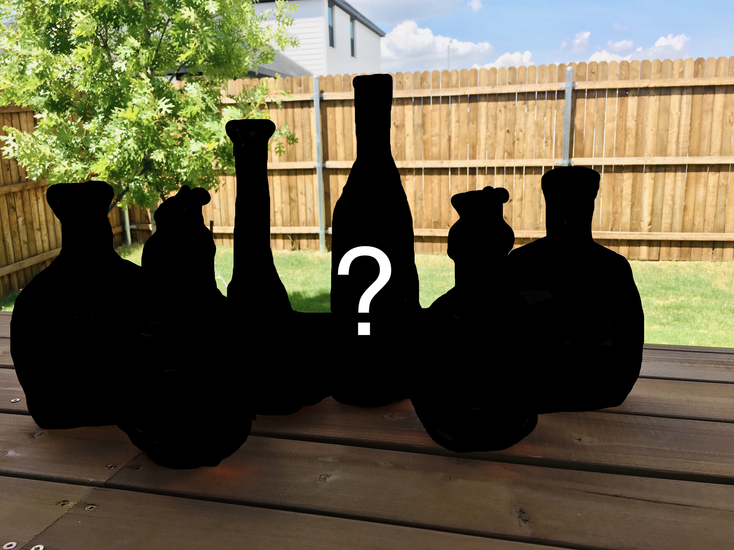
Without further ado, here is our list:
#5-Willett Pot Still
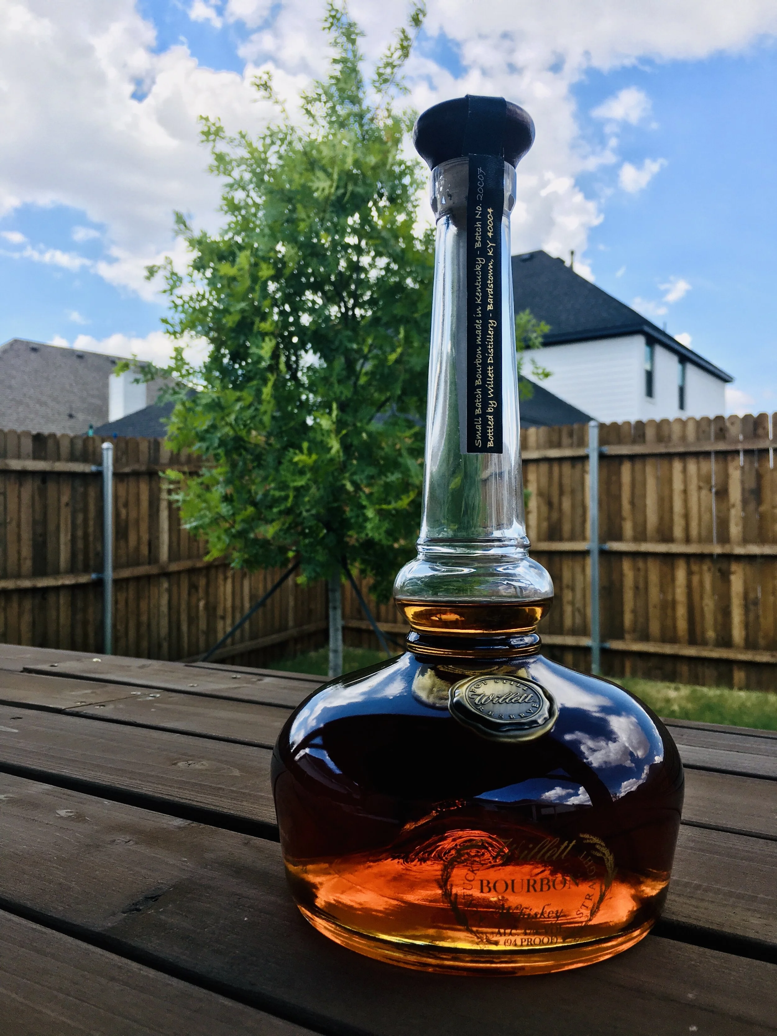
Coming in at number 5 is Willett Pot Still. You might be saying, “what about the Rye Family Reserve?”, which is a great looking bottle, but this is a bourbon bottle list, not a rye whiskey list. What makes this bottle great is that the bottle is shaped like the pot still that it is distilled in. You won’t see a sourced, fly by night company using this bottle like you will other generic bottles. I’ve talked to people that don’t really like the look of this bottle and think it is trying too hard, but we think that the uniqueness of the bottle and classic design qualify it for the list.
This bottle also comes with a hang tag, which is a great way of telling the bourbon’s story, without adding unnecessary writing to the bottle. The simple seal is a nice touch as is the use of an actual cork, which many companies are skipping for a rubbery plastic cork looking object.
#4-Wild Turkey Kentucky Spirit
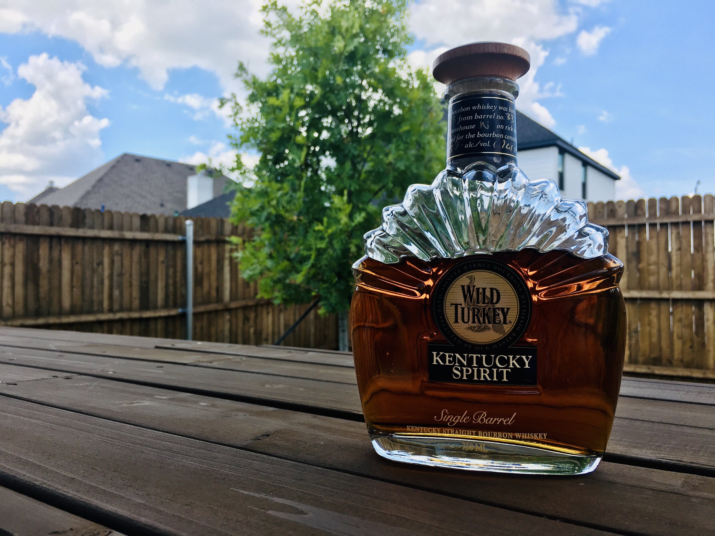
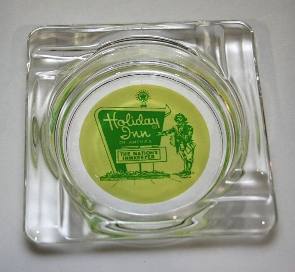
For me, Wild Turkey Kentucky spirit, has to be one of the best values in bourbon, and is almost always on the shelves at my local stores. Not only is the bourbon fantastic, but this generation bottle really stands out. I described the look of this bottle to a friend one time as “art deco meets 1970’s Holiday Inn ashtray”, which was a compliment. I remember looking at those glass ashtrays in hotel rooms on them and being fascinated with the circle logo on that clear glass. I placed a pic on one of those ashtrays above for questionable nostalgia purposes. This bottle also has just the right amount of logo on it, not too much, not too little, but just right. Wild Turkey has changed the design of this bottle, but I will keep filling it up with Kentucky Spirit from the new design indefinitely.
#3-Van Winkle 12 Year-Lot B

Many people think that the Pappy Van Winkle bottle with Pappy’s picture on it, or the Old Rip Van Winkle 10 year with the cartoon sketch on it are great looking, but we think the Van Winkle Family Reserve Bottle really takes the cake as far as looks.
The bottle design alone is classic, but paired with the parchment colored label and simple red an black fonts, this one looks incredible. The label looks like it is made from the sacred manilla paper we used to use in elementary school. We love how special reserve is italicized below Van Winkle. Less is definitely more with the simple label, no logos and basic fonts. This bottle looks like it would be on a shelf of the study of a guy that has many leather bound books and apartment smells of rich mahogany.
#2-1792 Full Proof
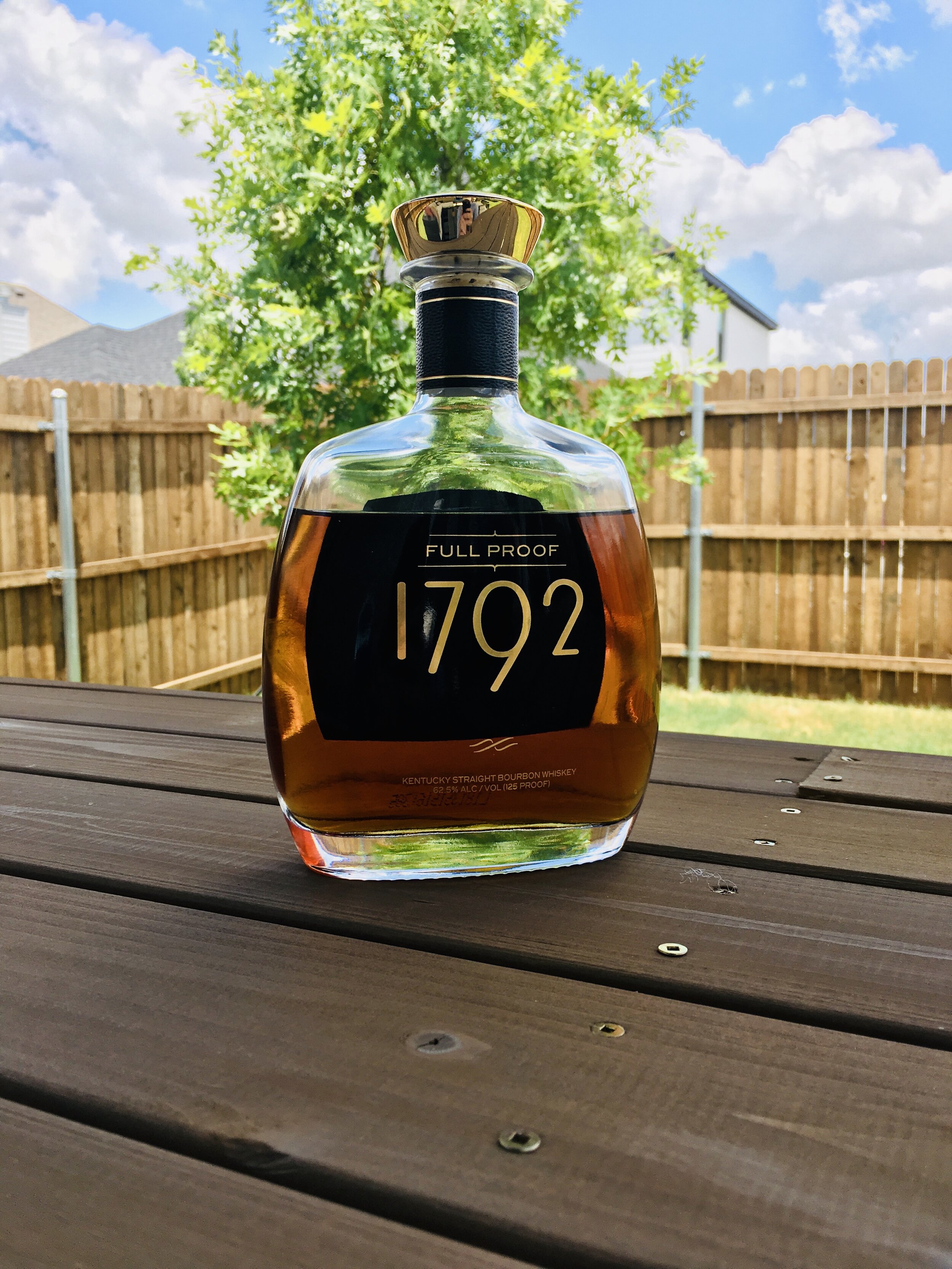
All of the 1792 Bourbon bottles look the same, but have different colored bands on the neck of the bottle. We chose to go with the Full Proof bottle, as opposed to some of the other expressions, with it’s black trim and gold accents. It looks to me like a spine from an encyclopedia sitting on a bookshelf and exudes class. There is not a huge label on the front, which makes the color of the bourbon the main focus behind the writing. The gold stopper looks better than it feels , but caps off (pun intended) a great looking bottle.
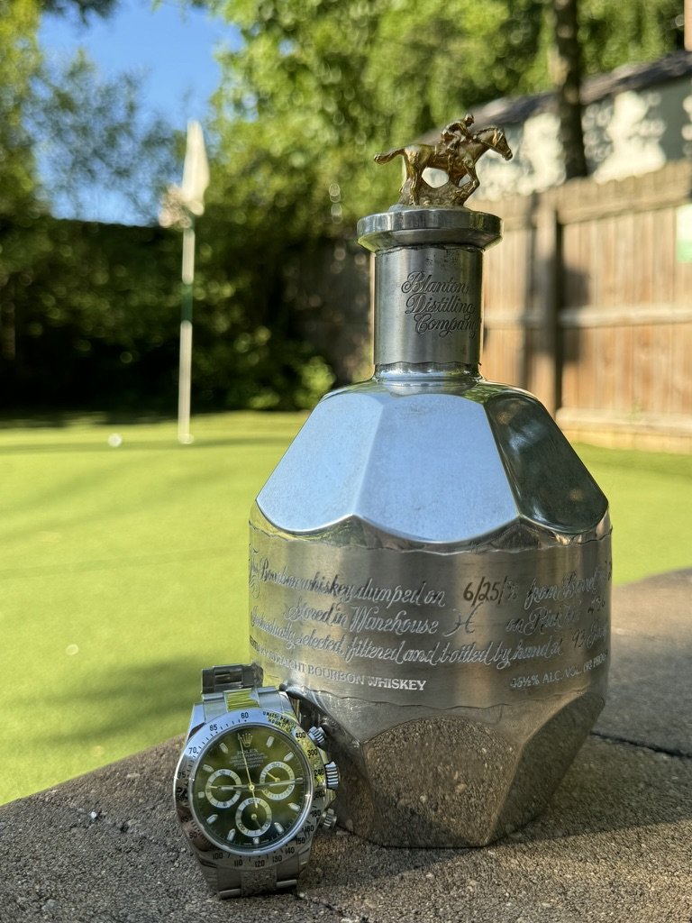
#1-Blanton’s & Blanton’s Gold

Blanton’s is our number one bottle for many reasons, mainly though, because I can remember the very first time that I saw this bottle. We put both of them on here, because both have features that truly make them stand out. Blanton’s Gold used to be a rarely seen oddity, but with it being sold in the United States now, it is seen from time to time. The bottle epitomizes it’s Kentucky heritage with the horse stoppers on the top, and the hand writing on the label really adds a touch rarely seen in these days of mass production. If we had to choose one bottle of these two on looks, the gold would edge out the standard Blanton’s due to the lack of label which allows the true color and character of the bourbon to be viewed and admired.
What are your favorite looking bottles? Feel free to post your top five best looking bottles below!
Cheers!